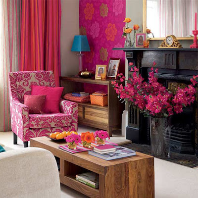
The rules of design have all changed. The new rule is that "there are no rules in design anymore". When I was in design school these were the rules dinned into our heads day after day after day....
Be aware of proportion and scale - no oversized furniture in small rooms and vice versa
Balance balance balance - either physically balancing items or visually
Create contrast for interest
Colors and textures - have a consistent theme, DO NOT pick colors adjacent on the color wheel....
These were the 4 basic mantras we chanted all day long under the Interior Design Dept. Dean's watchful eye. Not that we got rapped on the knuckles if we violated any of these...we were too old for that, some of the older women in class in their 50's would have taken him out - but he gave us "the glinty eye" if we blundered.
Well, that was a long time ago and I bet Thomas Nielsen has had to revise his lessons....because now everything has changed. I see pinks and reds living happily side by side, I see primary colors one would expect to see in a kids playroom in the most sophisticated of living rooms, more and more rooms have sleek modern contemporary furniture rubbing elbows with vintage worn pieces, big oversized sofas making tiny rooms look even cozier, global ethnic standing brazenly next to French Renaissance, handmade DIY's proudly displayed against an expensive backdrop and plush velvets and earthy jute holding hands...and the best part is - they all look fantastic!
So I say, throw caution to the winds, embrace your inner designer diva and have fun! When in doubt, do it! If you think that deep fuchsia is too psycho with that chocolate brown, then it probably is...and again so what? Its your house, you live in it....go for it! And if you need some inspiration to open up that wild side in you.....take a look at these pics! You'll be changed forever....


6 comments:
i loved this post :)...i am not a designer or decorator but can relate to what you said ...my friends who studied architecture keep mentioning what u say about rules being broken..
Kamini, the latest mantra is to go with with your instincts, I remember our Architect telling us to stick to white and not experiment with bold colors, but, we all loved colors the bolder the better, and we did it our way, and never regretted our decision to stick to what loved.
Each of the pictures featured here in your blog speak for themselves: they are unique and different, and that is the whole idea. Great post.
I agree rama on using one's instincts. I'm not a design or decor person but love to create new looks in our home using my own ideas and inspiration from blogs and home tours. I do love symmetry in hanging artwork which is an old-school rule though.
I enjoyed this post so much, Kamini. I feel whatever you feel comfortable in your home you should go for it. I don't like to follow rules in my decorating. I know I am not an expert. I go with my instincts.
I just love love love - what ???? the way words flow from you. Awesome!!!!
Wow! Really? Thank god I don't know any of these rules...I think I have definitely picked colours adjacent to each other on the wheel... Your posts are always so educational K! Glad to have you in my circle :)
Post a Comment